Yesterday, we visited the Luxembourg arts fayre, as it’s not called. It’s a very good idea: galleries from around Europe come to the city’s exhibition hall, LuxExpo, and set up shop for a few days. It works for them; they get a local rich audience who appreciate art, and buy it. It works for me; I get to see contemporary artworks from many galleries across this part of Europe in one afternoon.
Actually, I suspect it really works for them: Luxembourg is a financial centre, and a classic bank investment is art. I imagined not just enthusiastic locals buying pieces (I saw a few being carried away), but contacts made for quiet purchases by the financial institutions. Corporates invest in art for similar reasons, and Luxembourg is not short of corporate headquarters. In other words, the rich bastard and big money atmosphere here lets me see a lot of interesting works.
The hall had 88 exhibition spaces, most of which were galleries, some of which were individual artists, and more than a few of which were groups of artists exhibiting collectively.
I must start, though, with an apology. I don’t get on with pop–art, because, I think, I find the underlying medium vapid and unsatisfying (except when I’m ill). It’s just not my cup of tea. I don’t enjoy car art either, but that’s because I photographed beautiful cars with beautiful girls back in the day, and wore out my taste. So, although there were many examples of both at the fair, no doubt including many fine examples (they wouldn’t have been picked up by the galleries otherwise), I won’t comment on them.
I don’t really know the language to describe the works properly. I can say what I saw, to some extent, but cannot do so exactly, in the manner of someone properly trained in the parlance. Still, I’ll give it a go.
I am rather fond of abstract work, and expected to find some interesting examples. I was quite appointed, actually. Here’s what caught my eye….
First up was espace 361, a French collective based in Aix en Provence. My eyes were drawn to Christiane Dumas’s resin works. They resemble the patterns you might see in oil on water, but more so. There was one striking work with various colours, but dominated by red on black. The artist carefully explained exactly how she got the results, but my French let me down. Take a look at her work here.
The next series of pieces that struck me were those of Viktoria Prischedko, from just across the border in Trier. There’s something particular about her landscape work that appeals to me. Although you can get a good idea of her choice of colours and blurry rainy landscape style from the linked gallery, the thing that really struck me was her composition. One piece was dominated by foreground rain–blurred wildflowers, yet on the top edge of the painting was an open village, without barriers of fences, a welcoming home.

I was really grabbed by the landscapes of the Russian artist Igor Oleinikov, represented by galARTfactory from Switzerland. I’m not a comic person (the publishing form, not the funny man), yet his style reminded me in many ways of classic serious comic imaginary. I photograph woodland, and have never really quite got the spirit in an image that I feel in the trees (although I’m on to something with my current work). Oleinikov has it.
But that’s not all. There’s something about his choice of colours. Most of his works were in thin sombre colours. Yet they always included something striking in a dominant saturated colour, an element that makes no sense purely in terms of landscape, showing there’s something else in the work. Even more fun, what’s obvious from the distance is quite wrong when looked at in detail: those look like bushes and trees until you look at them closely. The gallery lady said the paintings represent memory, with a dominant element standing out in the mind, and the remainder of the image giving it a setting. It’s a very different interpretation of memory to that in my work.
Indeed, the gallery lady who spoke to me about it had the enthusiasm of a lover for Oleinikov’s work. She really did like it. She kindly allowed me to take the photo shown here. I’ve kept it small in respect of the gallery; the images on their site are small too.
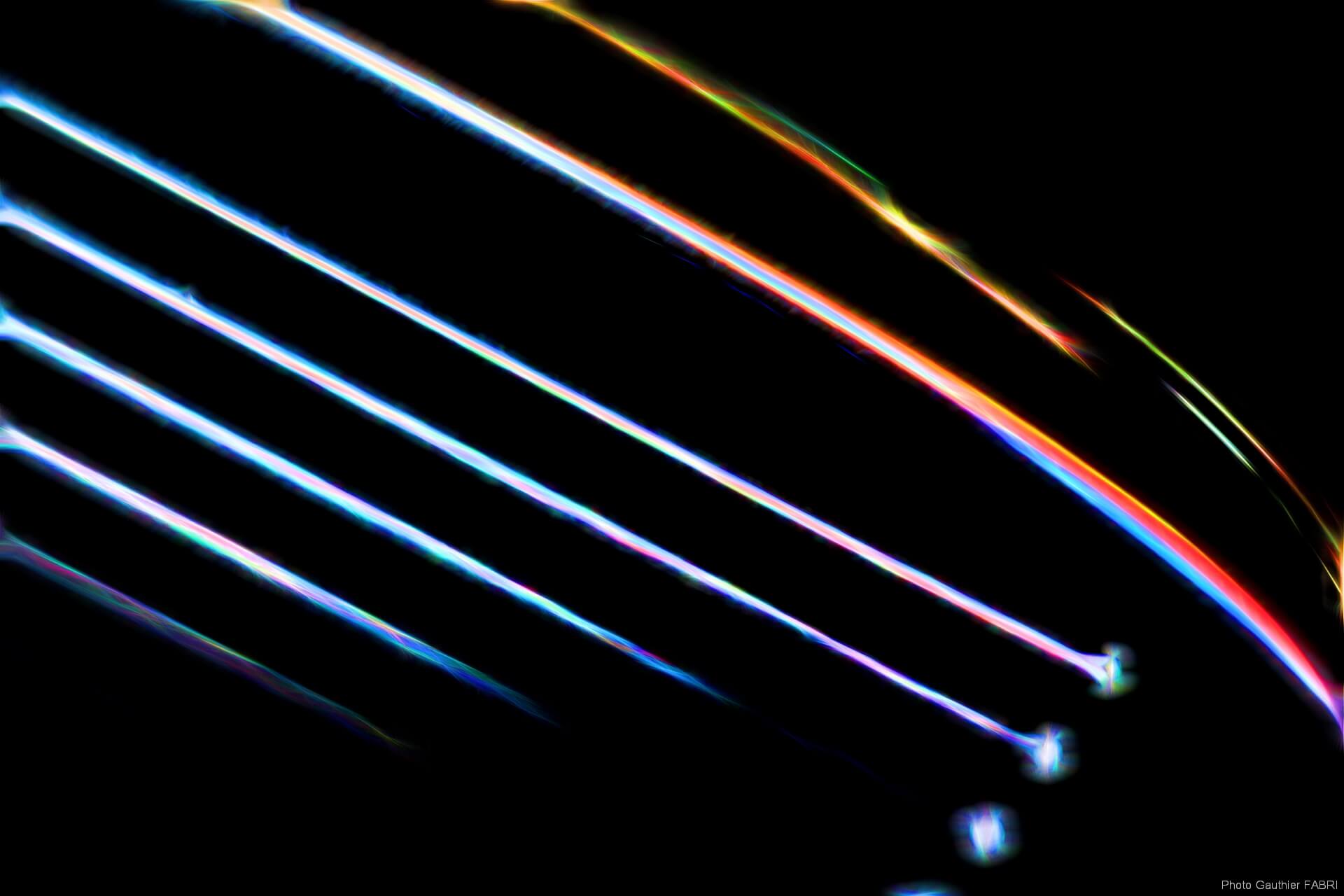
The Belgian Gauthier Fabri’s real job is wedding photographer, but he produces some gorgeous abstract photographs too. . He will take a high definition detailed shot of something, sometimes deliberately incorrectly, minimise it (minimise as in Reich, not Windows), then add in texture, colour, elements, until he has found a new balance that allows the now abstract photo to say what he wants it to say. The results are stunning. Take a look at For example, this image, which was originally a close up of a Zebra’s coat.
All in all, my time was very well spent there. I came out hugely impressed, and pretty exhausted. I’ll be going there next year. I think I might have found a few ideas to steal, too.