arts ego blog — site design
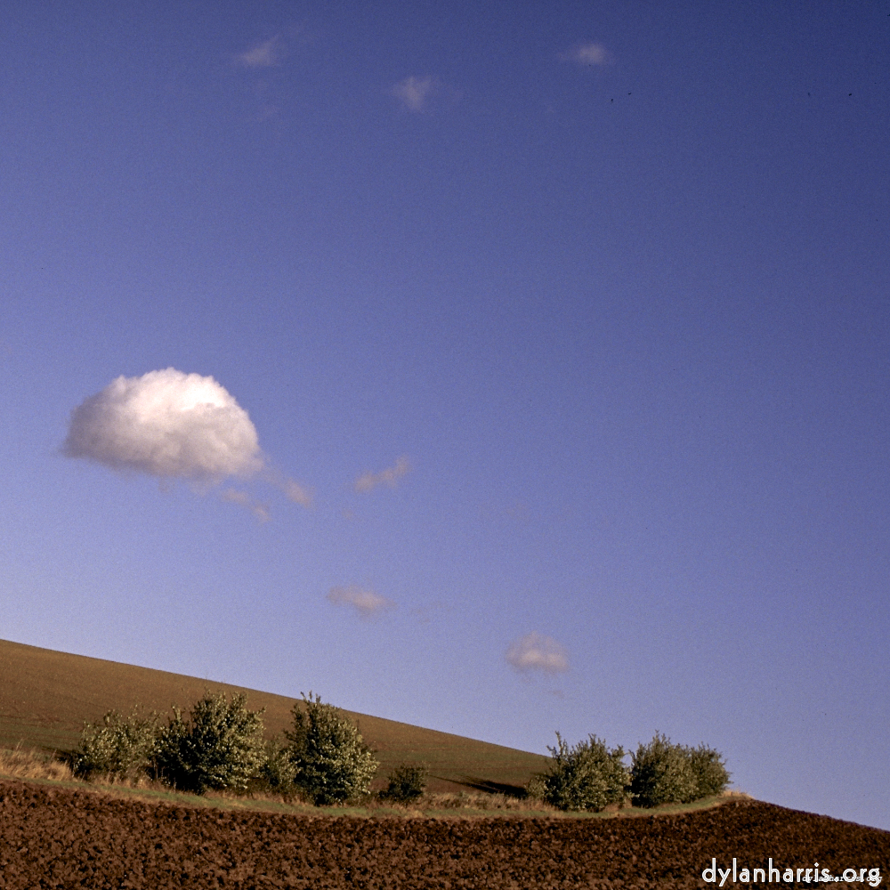
I’m no website designer, nor designer of any kind, as is no doubt obvious to the professional eye. All the same, there is some visual nous applied to the site. The site design is led by visual art, the one that interests me, the one that earns me pocket money, that clapham omnibus art, photography.
The site design principles are consistency, clarity, and bollox to the cowardice of convention. Clarity, note, does not mean obvious. Worse, for many, I’m a poet; what’s clear to me won’t be clear to all. All the same, the site shouldn’t take much exploration to grasp, for anyone who’s willing to make the effort. I suppose you could say the design filters out the uninterested, which is probably a good thing: I see little point in wasting people’s time when their thing isn’t my thing. Of course, this won’t suite people with little time on their hands, but, to be honest, I don’t expect people in a rush to visit anyway.
The visual design is dominated by the black background. That’s required for the photography. It’s the site consistency that puts the black background everywhere else.
So, to understand why my photography requires black, why a black background should be a consideration for any site showing images, you need to understand a photograph isn't just the photograph, it’s what it’s shown against. A photograph is always presented against a background. There are two standard colours, plain black and plain white. Others are used, usually for reasons beyond photography. For example, paintings were once often shown in ornate golden frames, not so much to enrich the art, more to show off the collector’s wealth.
Background colour is partially a matter of taste. It’s important the frame doesn’t complete with the content. It is important it contains the content, gives it an edge. The colour has to be strong but silent. To me, that’s black or white.
As a photographer, if I see black when I look in the outside world, I think of the night. The black symbolises the unknown. I can shine my torch into the black; I can see what was previously unknown. Unusually, it conforms with belief, but sometimes what’s there is not what’s expected. Black is the colour of potential discovery. If you accept what you’ve found with the torch, even if it contradicts your belief, then black represents reason to be. It represents clarity to be. The torch is the discovery, the reasoning, the clarity. Black is the colour that allows all this.
As a photographer, if I see a white when I look in the outside world, I think of fog. If I shine my torch into fog, I see nothing new, indeed with a powerful torch I see only glare. The stronger the torch, the stronger the glare, the less seen. Fog befuddles. Fog is not clarity, fog is confusion. White is the colour of the loss of clarity. The torch is useless in fog; reason doesn’t work when the torch cannot see. Perhaps this is why white is the colour of lies.
So the black background is chosen not just because it’s best for displaying photographs, not just because it symbolises discovery, reason and clarity, but also because it symbolises the unknown. I like to push the limits of the arts, to do things that haven’t been done before. My poetry has been known for that, admittedly in small circles. So black suites the poetry too.
Of course, a website has to be consistent, so the black is everywhere. There are problems with black, particularly with text. White text on a black background is bad. That’s why I don’t do it; I use a range of greys. Indeed, the text of this site uses certain google fonts: they’re beautiful, they work well on black, although unfortunately they don’t seem to have ligatures.
It’s coincidental the layout of this site, in many places, resembles Microsoft’s Modern. I started presenting photographs in square format in 2008, and it spread across the site. I became aware of the precursor to Modern when I saw Windows Phone 7, I think in 2011. Although I started using square format well before I encountered Modern, I am very aware of Modern, and undoubtedly there’s been some influence.
The design of arts & ago has evolved over the twenty years since I started it’s precursor sites, xenakis and cyberspace. It’s gone from frankly awful to really rather good. Mind you, I always thought it was really rather good, which actually means I’ve not got the taste to judge it properly. It needs review.
The difficulty then arises that I don’t know many websites suitable for comparison. Most websites are designed for things nothing to do with my purpose. That doesn’t mean there’s nothing to be learnt, far from it, but it does mean the general principles are the thing to learn, e.g. go read a book. I’ve done that, that’s why this site is responsive. I’ve also read books and ignored their advice; that’s why I’ve not presumed people visiting the site are big children.
But I do find most websites are more of the same. The better ones are refined more of the same. Nothing seems to question assumptions that I’ve already found to be false, in my opinion of course. A good directory of innovate personal websites is sorely needed.


